Campaign Design for WWF
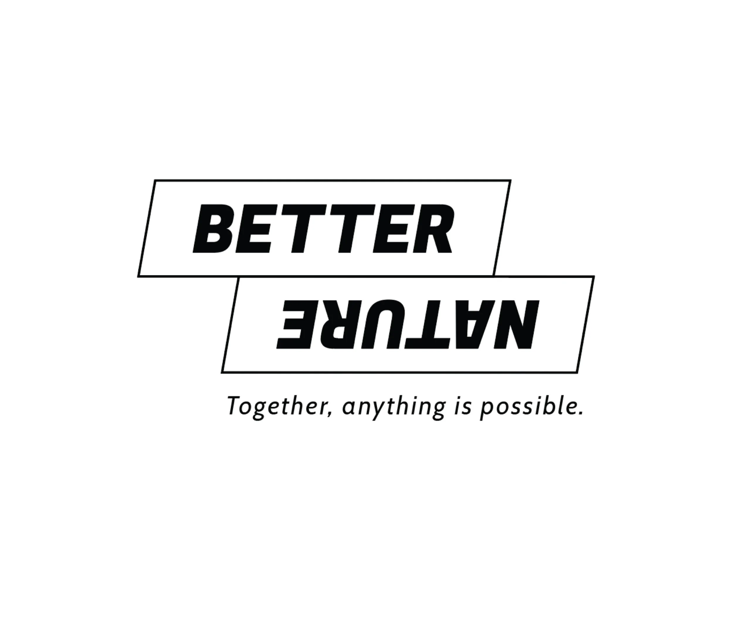
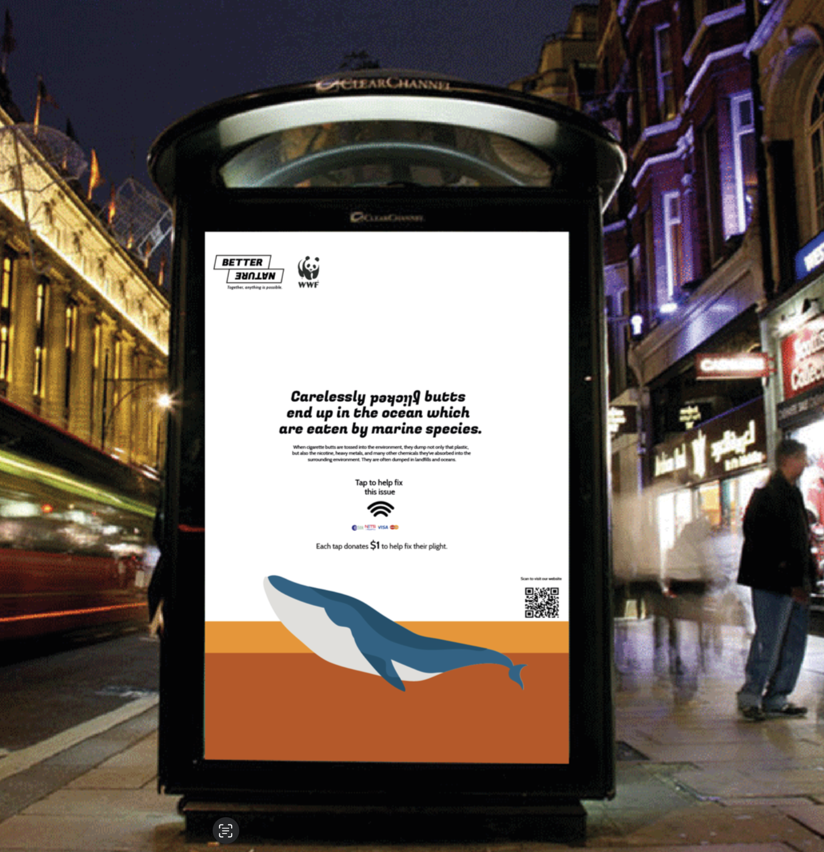
The main idea behind this awareness campaign is to create awareness about the ongoing and upcoming environmental issues which need to be immediately dealt with. The target audience is 30-50-year-olds who make up a major part of the working class. This group of audience does not have much time or patience to look into information on posters and other forms of media. Hence my main theme is to keep the awareness campaign bold,simple, straightforward and eye-catching. The information in the campaign will mainly contain knowledge that any common person can easily grasp and the steps that are suggested to help save the planet will be simple to do in any common person’s day to day life without taking much effort. The campaign name that I am assigned is “Better Nature”. With a sufficient amount of initial research, I chose to use “An appeal to your better nature” as my key phrase which I used to derive my logo design. The design looks bold and simple as per the theme. The word “Nature” is written upside down to kindle the thoughts of human instincts and reflection in the viewer. It also brings out the message that everything (nature) is upside down and we have it to fix it. The blocks are set in such a way so as to suggest chaos and that it needs to be fixed. The shape of the blocks also suggest movement. The typeface I have used is simple and bold. I have mainly used black and white to bring about a sense of originality and reality.


